
They serve as silent salespeople, grabbing attention, conveying brand values, and persuading consumers to make a purchase. Full-colour labels, in particular, offer a vibrant and versatile canvas to showcase your product’s personality and appeal. But designing labels that truly sell requires more than just splashing bright colours and bold fonts. It’s an art and a science that blends creativity with strategic thinking.
This article explores the essential principles and practical tips for designing full-colour labels that not only look stunning but also convert browsers into buyers. Whether you’re launching a new product or refreshing an existing line, understanding how to craft compelling labels can significantly impact your bottom line.
Understanding the Role of Full-Colour Labels in Marketing
The Power of Visual Appeal
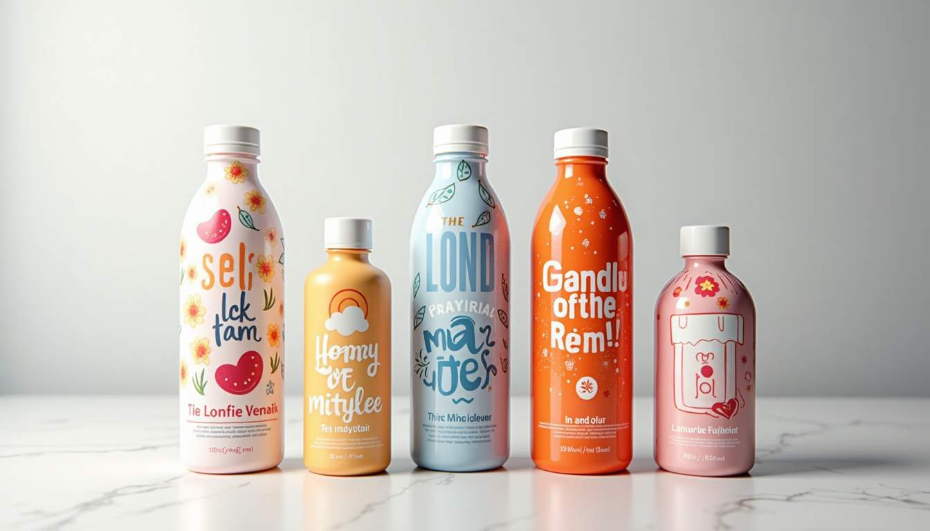
Human beings are inherently visual creatures. Studies show that people process images 60,000 times faster than text, and colour can increase brand recognition by up to 80%. Full-colour labels leverage this natural tendency by creating eye-catching designs that stand out on crowded shelves. Vibrant colours can evoke emotions, communicate quality, and tell a story without a single word.
For example, a bright red label might evoke excitement and urgency, perfect for a spicy sauce or energy drink. In contrast, soft pastel colours can suggest calmness and gentleness, ideal for skincare or baby products. Choosing the right colour palette is crucial because it sets the tone and influences consumer perception from the first glance.
Building Brand Identity Through Labels
Your label is often the first touchpoint between your brand and the consumer. It’s an opportunity to convey your brand’s personality, values, and promise. Consistency in colour usage, typography, and imagery helps build recognition and trust over time.
Consider iconic brands like Coca-Cola, whose red and white colour scheme is instantly recognizable worldwide. Their label design reinforces their brand identity and evokes feelings of nostalgia and happiness. When designing your full-colour label, think about how it fits within your broader branding strategy. Are you aiming for luxury, affordability, eco-friendliness, or innovation? The label should visually communicate these attributes. To explore high-quality label design solutions, visit Libra Labels for expert craftsmanship and creative inspiration.
Key Elements of Effective Full-Colour Label Design
Colour Selection and Psychology
Colour psychology plays a pivotal role in label design. Different colours can trigger various emotions and associations, influencing buying decisions. Here’s a brief overview of common colours and their typical connotations:
- Red: Energy, passion, urgency, appetite stimulation
- Blue: Trust, calm, reliability, professionalism
- Green: Nature, health, freshness, sustainability
- Yellow: Optimism, warmth, attention-grabbing
- Purple: Luxury, creativity, sophistication
- Orange: Enthusiasm, friendliness, affordability
- Black: Elegance, power, modernity
- White: Cleanliness, simplicity, purity
When selecting colours, consider your target audience and product category. For instance, health-conscious consumers might respond better to green and white tones, while a tech gadget might benefit from sleek black and metallic hues. Avoid using too many colours that clash or overwhelm the design; a harmonious palette of two to four colours usually works best.
Typography: Readability Meets Personality
Typography is more than just choosing a pretty font. It affects readability, brand tone, and overall aesthetic. For full-colour labels, contrast between text and background colours is essential to ensure legibility from a distance. Avoid overly ornate fonts that can be hard to read, especially on smaller labels.
Pairing fonts can add personality and hierarchy to your label. For example, a bold sans-serif font for the product name combined with a clean serif font for additional details can create a balanced and professional look. Keep in mind that the font style should align with your brand’s voice—playful, serious, traditional, or modern.
Imagery and Graphics
High-quality images and graphics can enhance a label’s appeal and communicate product benefits quickly. Whether it’s a photograph of fresh ingredients, an illustration, or abstract patterns, visuals should complement the overall design and not clutter it.
For full-colour labels, consider how images will reproduce in print. Ensure they are high resolution and colour-corrected to maintain vibrancy. Transparent backgrounds or overlays can add depth and sophistication. Additionally, incorporating subtle textures or patterns can make your label feel tactile and premium.
Designing for Practicality and Compliance
Size and Shape Considerations
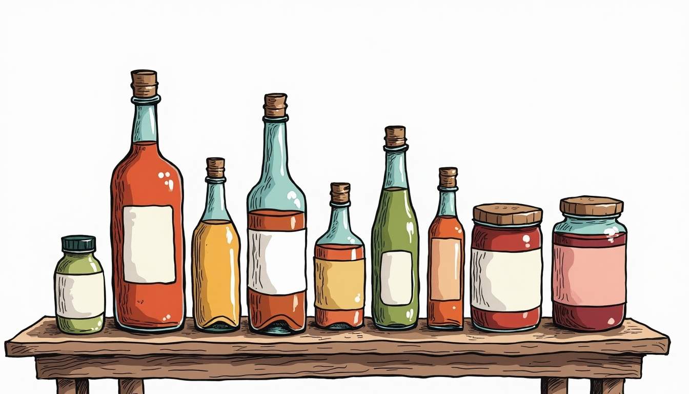
The physical dimensions and shape of your label affect both design and functionality. Labels must fit the packaging perfectly without wrinkling or peeling. Common shapes include rectangles, ovals, circles, and custom die-cut designs that follow the product’s contours.
When designing in full colour, keep in mind that intricate details may get lost on smaller labels. Simplicity often enhances impact. Also, consider how the label will be viewed—whether on a shelf, in a fridge, or on a display stand—to optimize visibility and appeal.
Material and Finish Choices
The choice of label material and finish can elevate your design and influence consumer perception. Glossy finishes enhance colour vibrancy and catch the eye with a shiny surface, while matte finishes offer a sophisticated, understated look that reduces glare.
Materials range from paper to synthetic films, each with different durability and tactile qualities. Waterproof or oil-resistant labels might be necessary for products like cosmetics or food items that encounter moisture. Embossing, foil stamping, and spot UV coatings can add texture and luxury, making your label stand out physically as well as visually.
Regulatory and Legal Requirements
Labels must comply with industry regulations, which vary depending on the product type and region. Common requirements include ingredient lists, nutritional information, barcodes, batch numbers, and safety warnings. These elements need to be incorporated without detracting from the overall design.
Planning for these mandatory details early in the design process ensures a balanced layout that meets legal standards while maintaining aesthetic appeal. Working with experienced label printers or compliance experts can help avoid costly redesigns or legal issues.
Tips for Creating Labels That Convert
Focus on the Consumer’s Perspective
Understanding your target audience is key to designing labels that resonate. Consider their preferences, values, and shopping behaviors. What problems does your product solve? What emotions do you want to evoke? Tailor your label’s messaging and visuals to address these factors.
For example, eco-conscious buyers appreciate labels that highlight sustainability credentials with earthy colours and clear icons. Foodies might be drawn to artisanal fonts and mouth-watering images. Conducting surveys or focus groups can provide valuable insights into what appeals most to your customers.
Create a Clear Hierarchy of Information
Effective labels guide the consumer’s eye through the most important information first. Typically, the product name or brand logo should be the most prominent element, followed by key benefits or unique selling points. Secondary details like ingredients or instructions can be smaller but still legible.
Using size, colour contrast, and spacing strategically helps establish this hierarchy. Avoid clutter by limiting the amount of text and focusing on what truly matters to the buyer at the point of sale.
Test and Iterate Your Designs
Designing labels is an iterative process. What looks good on a computer screen might not translate perfectly to print or on the shelf. Request physical proofs from your printer to check colours, finishes, and readability under different lighting conditions.
Gather feedback from colleagues, retailers, and potential customers. Small tweaks in colour saturation, font size, or layout can make a big difference in effectiveness. Don’t hesitate to experiment with multiple concepts before finalizing your design.
Leveraging Technology for Superior Full-Colour Labels
Digital Printing Advances
Digital printing technology has revolutionized label production, making full-colour designs more accessible and affordable. Unlike traditional printing methods that require costly setup and minimum runs, digital printing allows for short runs, customization, and rapid turnaround.
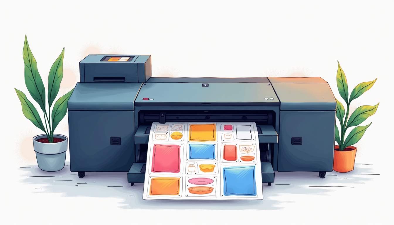
This flexibility enables brands to test different designs, personalize labels for promotions, or update information quickly. High-resolution digital presses produce vibrant colours and fine details that enhance the overall quality of your labels.
Design Software and Tools
Modern design software like Adobe Illustrator, Photoshop, and specialized label design programs provide powerful tools to create professional full-colour labels. These platforms support colour management, layering, vector graphics, and precise layout control.
Using templates and mockup generators can help visualize how your label will look on the actual product. Additionally, colour calibration tools ensure that what you see on screen matches the printed output as closely as possible.
Augmented Reality and Interactive Labels
Innovative brands are now incorporating augmented reality (AR) into their labels to engage consumers in new ways. By scanning a label with a smartphone, customers can access videos, recipes, tutorials, or promotional offers, adding value beyond the physical product.
While this goes beyond traditional full-colour design, integrating QR codes or subtle AR triggers into your label can enhance the consumer experience and differentiate your brand in a crowded market.
Conclusion
Designing full-colour labels that sell is a multifaceted challenge that combines artistic creativity with strategic marketing and practical considerations. By understanding the psychology of colour, prioritizing readability, aligning with brand identity, and adhering to regulatory standards, you can create labels that not only attract attention but also build trust and inspire purchases.
Remember, your label is often the first impression your product makes. Investing time and resources into thoughtful design pays dividends in customer engagement and loyalty. Embrace technology, seek feedback, and continually refine your approach to stay ahead in the dynamic world of product packaging.
Ultimately, a well-designed full-colour label is more than just decoration—it’s a powerful tool that tells your brand’s story and convinces consumers that your product is the right choice.
Comments
0 comment